In Uzbekistan, tea is not just an everyday drink. This is part of the local culture, the Uzbek people, a symbol of hospitality and kindness. Therefore, the importance of tea products in each region of Uzbekistan is increasing day by day.
We were contacted by our client, a local tea manufacturer based in Karakalpakstan. They needed to develop a name, logo and packaging design for a new product. Our team started with research. As a result of research, we found out that in the history of Karakalpakstan there were five fortresses ruled by five khans.
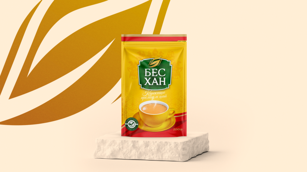
Based on this information, we have decided to name the new product “Bes Khan”. It means “Five Khans”. At the next stage, we developed a logo that combines the chosen name and product type. In the logo, we showed a tea leaf representing the number five.
We paid special attention to the packaging design and tried to make it bright and attractive. In this case, we combined bright yellow, which is a symbol of the sun, with green, which represents naturalness. In addition, we gave the product a slight red accent to grab the attention of shoppers on store shelves.
The packaging design depicts an illustration related to the history and traditions of Karakalpakstan. These places are famous for milk tea, the favorite symbolic drink of the Karakalpaks. Our product is ideal for making milk tea. To emphasize this more clearly, we have shown an image of tea with milk in a cup on the front of the packaging. On the reverse side, we wrote instructions for its preparation.
This case of ours has been recognized by the World Brand Design community and joined the ranks of global brands.